How to paint like Caravaggio: Master copy of “Narcissus”
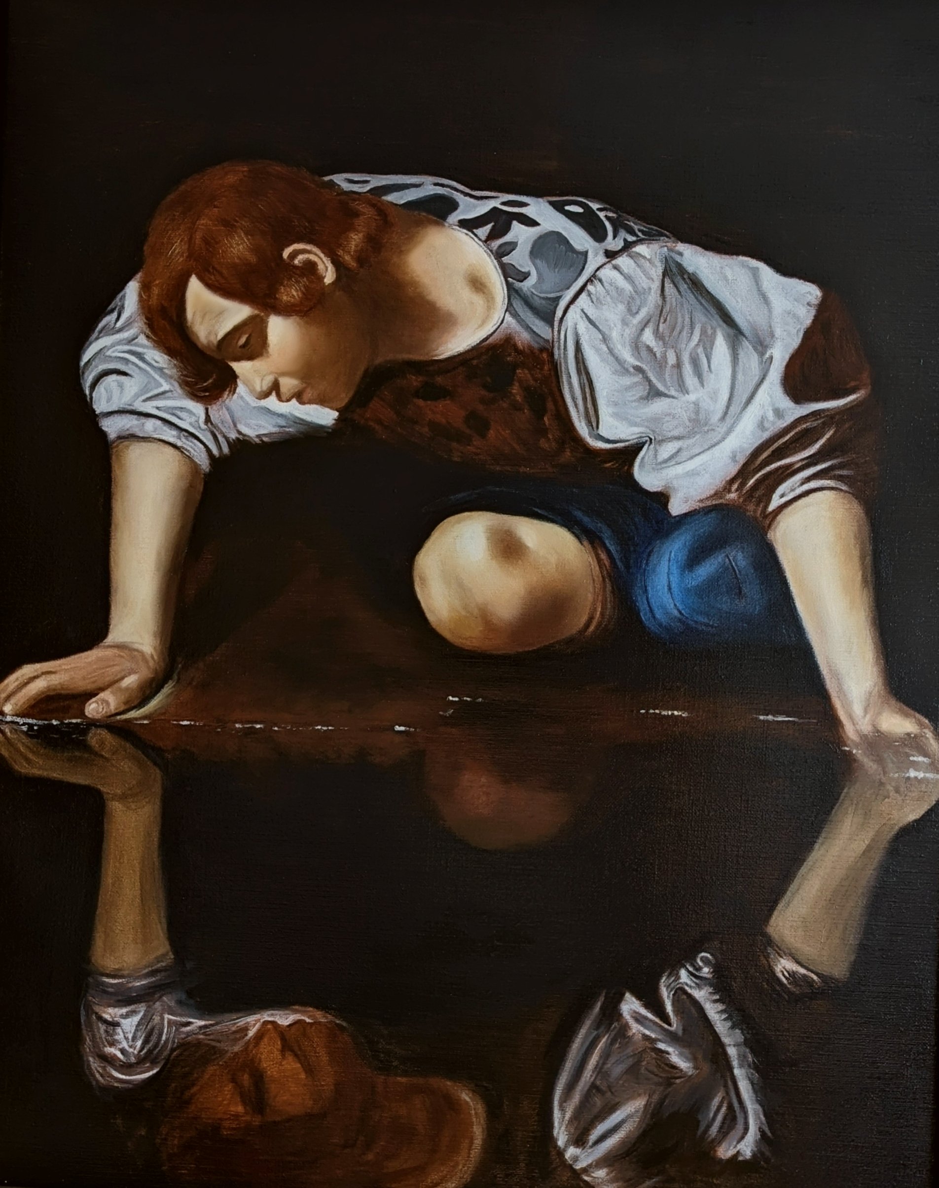
Narcissus - after Caravaggio c. 1597–1599
In this article, I will talk through my thinking and painting process for a study I completed a few years ago of Caravaggio’s “Narcissus”. Copying this painting provided insights in to this more Baroque manner of painting - compared to, for example, some of the more Northern European style work - which employs different techniques.
Is this an exact, historically accurate reproduction? Of course not! There is no way of perfectly undergoing the same thought processes as Caravaggio would have done at the time of painting. For a start, I have already the design and final painting in front of me, in addition to a rough game plan as to how I will approach it. Caravaggio on the other hand, had no such reference (short of some preparatory drawings) and would have been making design and technical decisions live during the painting process. However, that caveat aside, much of my approach is set out based on historical references - from both contemporary written resources and post-mortem analysis carried out during the various conservational investigations on this piece. The sources for which, I will list at the end of this article. They provide an invaluable resource for anyone wanting to incorporate some of the techniques and ideas of this school into their own work.
Materials used:
The following materials were chosen and used, based on the resources available from the National Gallery, London’s technical bulletin and analyses of Caravaggio’s painting materials. (See references at the bottom of the page):
Size: Rabbit skin glue
Canvas: Coarse grain, heavy linen (465 gsm) from Claessens.
Pigments: Ivory black, bone black, lead white, burnt umber, raw umber, yellow ochre, lead-tin yellow, vermilion, ultramarine blue
Ground: Red earth, umber, bone black, lead white, chalk, linseed oil
Medium: Extra pale cold pressed linseed oil, sun-bodied linseed oil & walnut oil
Varnish: Dammar varnish
Some notes:
I am unsure whether carbon black (lamp black), bone black, or ivory black was used in the original. Here, I opted to use bone black for the background and ivory black for making the greys. The mixture of ivory black with lead white gives a cool grey, which when placed next to the warm ground gives the lovely silvery effect seen on the tunic.
Caravaggio’s pallet was known to change between paintings (as indeed did his technique), however a limited pallet (very typical of the time) comprising mostly earth pigments, black, and lead white was used.
Caravaggio’s ground colour is also known to change significantly between paintings - favouring a more traditional orange/brown early on in his career and then really dark grounds later on. Here, I base the tone/colour of the ground on peering through the exposed areas of reproductions of the original. I believe it to be a medium dark brown/orange. Of course, the original also has hundreds of years of the linseed oil yellowing and darkening, so the exact colour can never be known. But a bit of guess work, combined with the knowledge of the exact pigments hopefully gets the approximation pretty close.
This was only the second painting I ever completed, in my life, and so much of this painting was a learning process for me - full of mistakes and learning curves as you might expect. My knowledge during its preparation was significantly limited compared to now and I by no means claim that this is an authoritative reproduction - although it isn’t bad!
Step 1: Canvas preparation
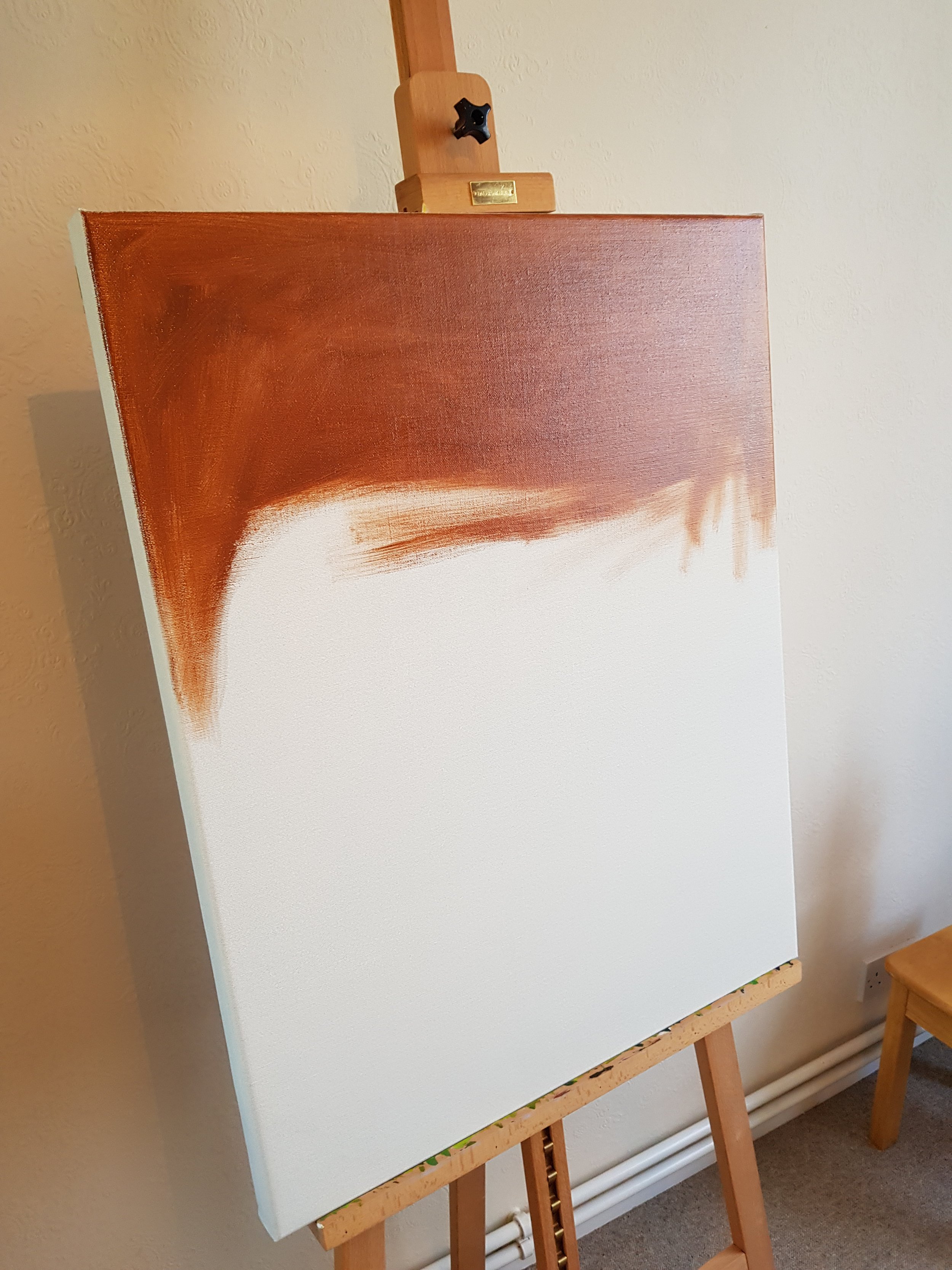
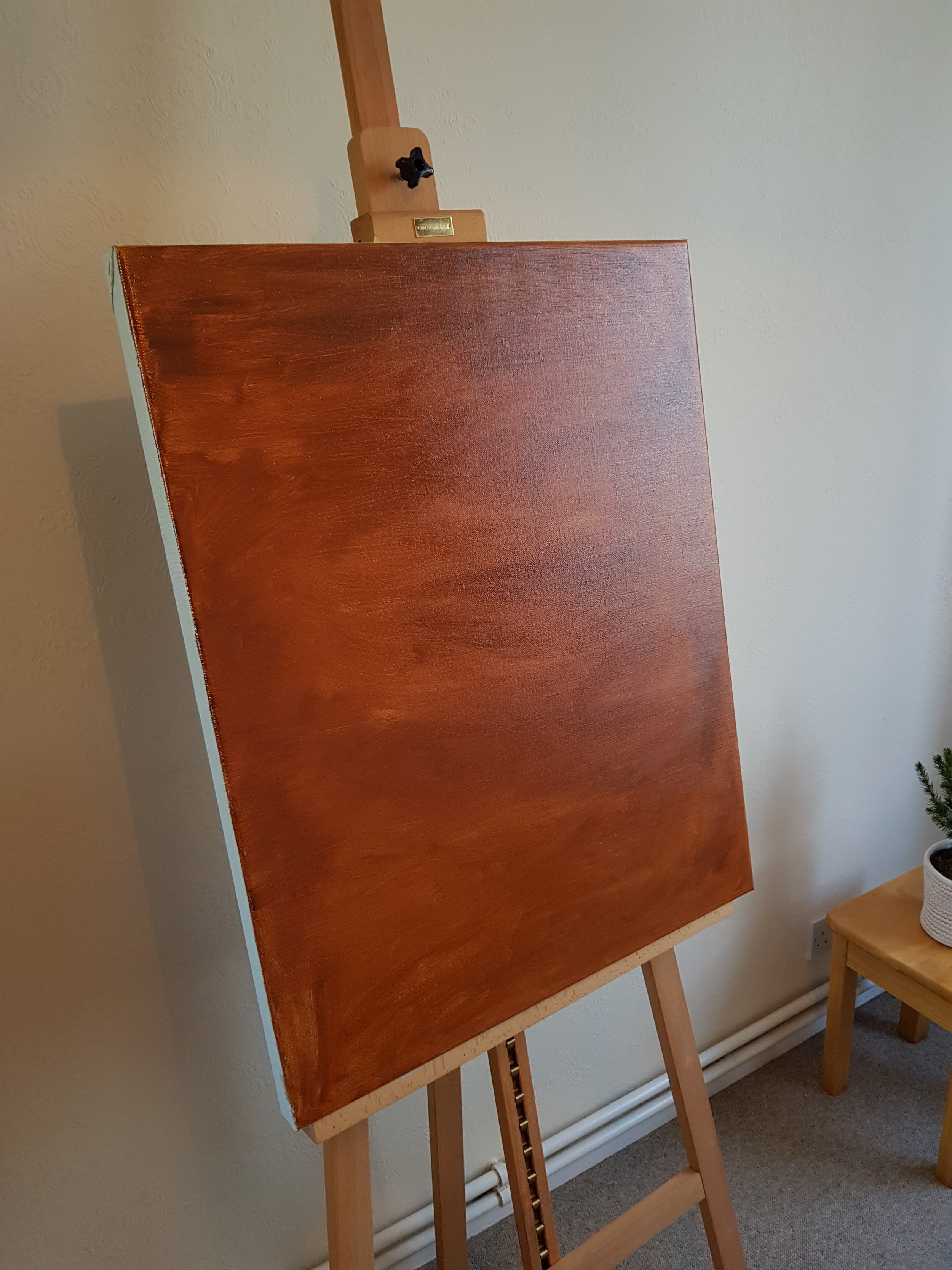
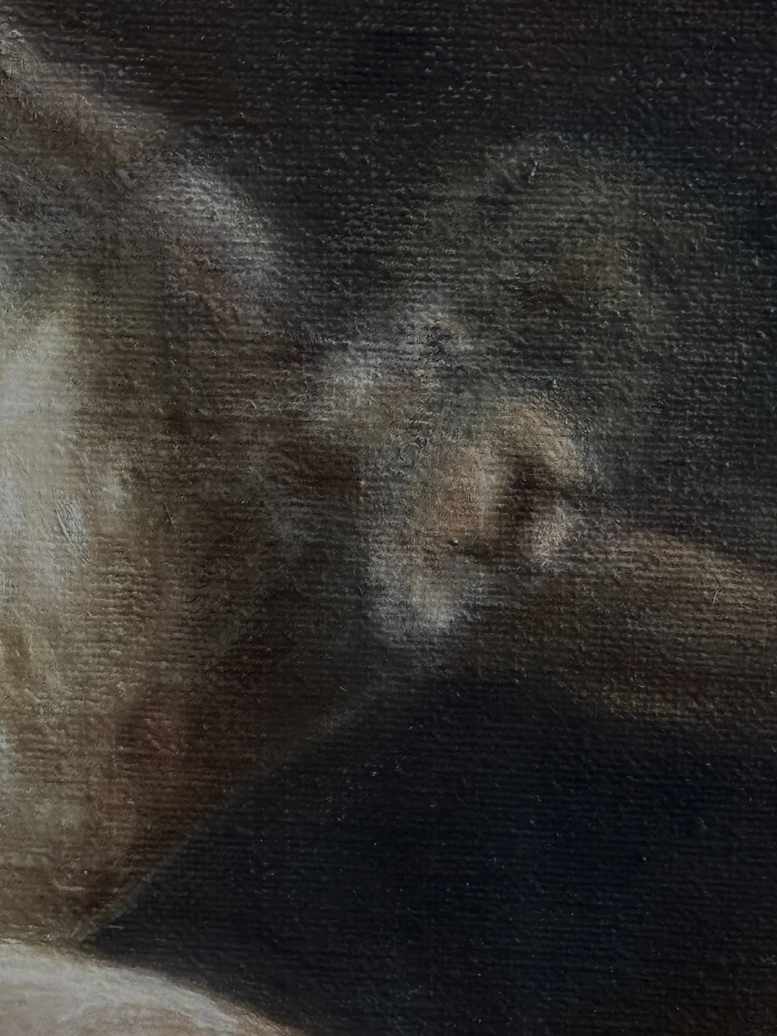
To begin, it is well known that Caravaggio worked with a reasonably dark ground. Not only is this known from cutting edge microscopy studies, but in many of his paintings, the ground itself plays in an integral role in the final composition. It is often left exposed to act as a mid-tone. This technique is indeed the case in this painting here. Therefore, it is absolutely critical that the canvas be prepared accurately for the recreation of this piece by Caravaggio. Here, I use a relatively course linen which is first sized with rabbit skin glue and then a first ground layer of lead white. Over this a second ground is applied, comprised red and brown earth pigments in linseed oil. For this I mixed red bole (red earth), burnt umber, and a bit of ivory black to achieve the desired tone. The tone, I based on examination of the original work where the ground is clearly visible through the upper layers, such as in the earth upon which Narcissus is kneeling or in the hair.
In retrospect, I believe that the second ground layer should also be as opaque and thick as the cream coloured one underneath. Typically, I also now understand the ground layers to have been applied by use of knife (like spreading butter on toast) to achieve a smoother painting surface - whereas here, I use a bristle brush to apply the ground. This approach is described in a few 17th century treatises on painting.
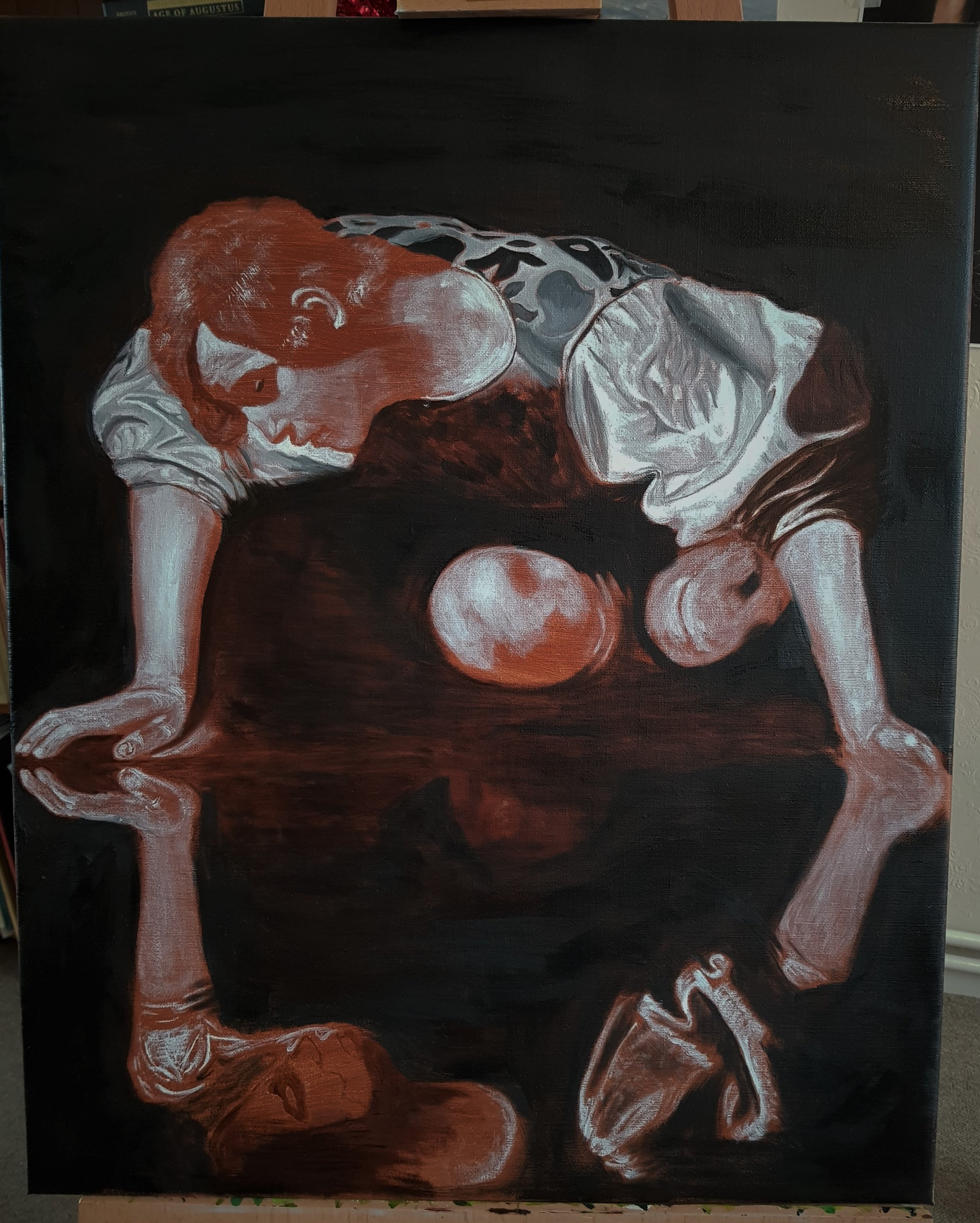
Step 2: Transfer of preparatory drawing and initial application of lead white
First steps: Use of lead white to establish the initial light-tones. The addition of the darkest tone (background). You can also make out the pouncing from the drawing transfer in white chalk.
The next step, given that I have the benefit of knowing the design before the painting stage begins, was completing a rough preparatory drawing from the original. This I then transferred to the toned canvas by the “prick and pounce” method. The transferred outline in chalk was reinforced with a very thin brush and ink-like burnt umber to seal the drawing. You’ll have to forgive me for forgetting to take a photo after this stage.
I then believe it to be the case that Caravaggio would approach the canvas with first the light regions, using lead white in layers of varying thickness to define the light tones of the painting. The beginning of this process can be see in the image to the right. I must emphasise here that the use of lead white is absolutely essential. Due to its translucency, it is possible to modulate the value of the lights by the thickness of its application. Titanium white on the other hand (the now almost ubiquitous modern alternative) I find to be far too opaque to achieve the required subtleties. Furthermore, lead white is an extremely fast-drying paint, therefore allowing very quick progression on this part of the painting process. The ability to scumble the light tones in with lead white is absolutely unmatched with alternative white pigments, which simply don’t have the same sort of handling.
I began with only the white at this stage, but unfortunately forgot to capture a photograph before adding in a thin layer of ivory black for the background - which came next. It is hard to know whether or not Caravaggio would have painted in the background so early in the process. The downside is that it makes fixing outline issues difficult, should you want to change the drawing after committing such a dark value. (Not an issue for me here, since I was 90% confident of my under drawing). The upside is that establishing the darkest value makes working in relative tone far easier. That is, I could quickly establish the absolute tone of the various shadow tones, mid-tones, and high-tones, with reference to what I now know to be the darkest tone in the whole composition.
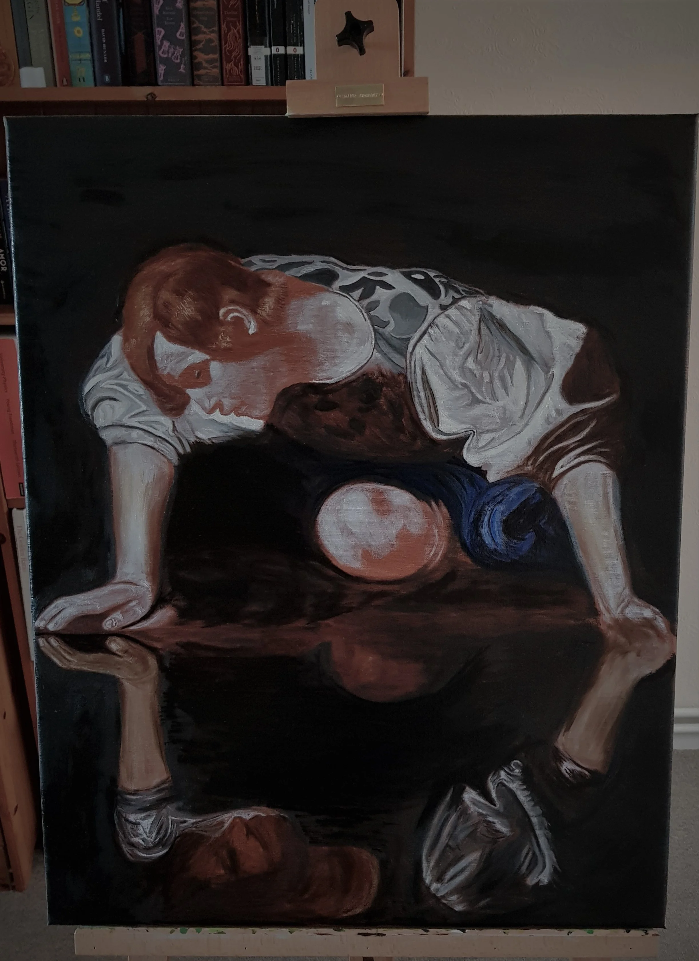
Step 3: Finer workings in the mid and dark tones

Working particularly in the mid and dark tone regions using umber and lead white. The ground colour is still left exposed in many places to act as a warm mid-tone. Even at this stage, the lead white gives a wonderful ‘sculpted’ effect - look for example at the sleeve.
Next, having put in basic shapes for the lighter regions of the painting, I use pure umber pigments to start adjusting the details in the shadow regions of the painting. For example, in the creases of the sleeve, the underside of the tunic, and the face in the reflection. It is worth noting here, how in the finished painting, the face in the reflection looks really nothing like that of Narcissus. It is also painted in an incredibly rough fashion - defined by only a very limited amount of modelling with the dark umber. There are many theories as to who the face in the reflection belongs to - including that of Caravaggio himself. These theories aside, it highlights a really important compositional device. That is, the coarseness of the reflected face relative to the real face registers more truly how the human eye sees, compared to a photographically accurate picture of Narcissus in the reflection.
This effect, is something that can be seen quite often in paintings in the post-photographic world which we inhabit. Now, with our exposure to photographically realistic pictures every moment of our lives, there is a temptation upon the artist is to incorporate this into their pictures. How many paintings have you seen of a lake, or a pond with a wonderfully accurate reflection depicted? Yes, it looks beautiful and requires consummate skill - but does it ever look just right? Not really - because this is not how our eyes see! We do not see a perfect reflection of the world in the surface of the lake - we know that it is there by its juxtaposition with the reality above the lake. Similarly, this less worked reflection of Caravaggio convinces the viewer that there is really a body of water there because it feeds our brains what it expects for a reflective surface, when our eyes are predominantly drawn to the real body and face, leaving the reflection in our peripheral.
In the reflected skin of Narcissus, I use specifically raw umber rather than burnt umber. The cool greyness of the raw umber registers almost as green compared to the incredibly warm background. This gives a subtle impression of dead flesh in the reflection. (Part of this concept can be seen in the verdaccio preparation of figures in traditional iconographic painting). The technique at play here is that cool colours recede and warm colours advance. Therefore, the cool reflection is pushed down into the water - adding some real depth to the pool in which we find the reflection. This also subliminally registers the reflection as being “not real” - it’s just a reflection. By juxtaposition the warmth and softness of Narcissus registers as positively full of life, as though breathing.
Also in this stage, I have completed a fuller modelling of the white sleeve using a technique that really is a trademark of Caravaggio’s genius. That is, rather than using pre-mixed values of grey to model the sleeve, the various shades of light and dark are achieved simply by the thickness and therefore transparency of the lead white, using the dark ground underneath to achieve beautiful subtleties in the shades and value of white. The inevitably thicker regions of the highlights as a result really glow from the canvas.
Step 4: Starting to add colour
The initial addition of colour to the tunic
Only at this stage I start working with actual colour. And when I say colour, here I mean various tones of grey/silver for the tunic - still nothing at all of high chroma. The silver is formed with a mixture of ivory black and lead white. The ivory black has a slight blueish undertone - which means that it forms beautifully ice-cold greys, especially next to the warm reds of the ground layer. This grey is also used to refine the modelling of the folds in the sleeve - using the brunaille underpainting as a guide, but with smoother brush strokes giving the appearance of a more brilliant and softer material.
Note how at this stage, the hair is still defined almost entirely by a few very simple highlights laid on top of the brown/red ground - yet it registers quite convincingly as hair! There is still at this stage a huge amount of exposed ground acting as a mid tone in the painting.
A critical aspect of painting in the Renaissance and Baroque (in fact, one of the defining features of the Renaissance) is the requirement for artists to have an intimate knowledge of human anatomy. Note here, how using the very simple application of lead white, the main muscles of the thumb of the left hand are denoted. Likewise, the tendons and ligaments of the wrist. Having this structure lying beneath the future layers of skin tone glazes adds such a convincing rendition of life to the depiction of the human body.
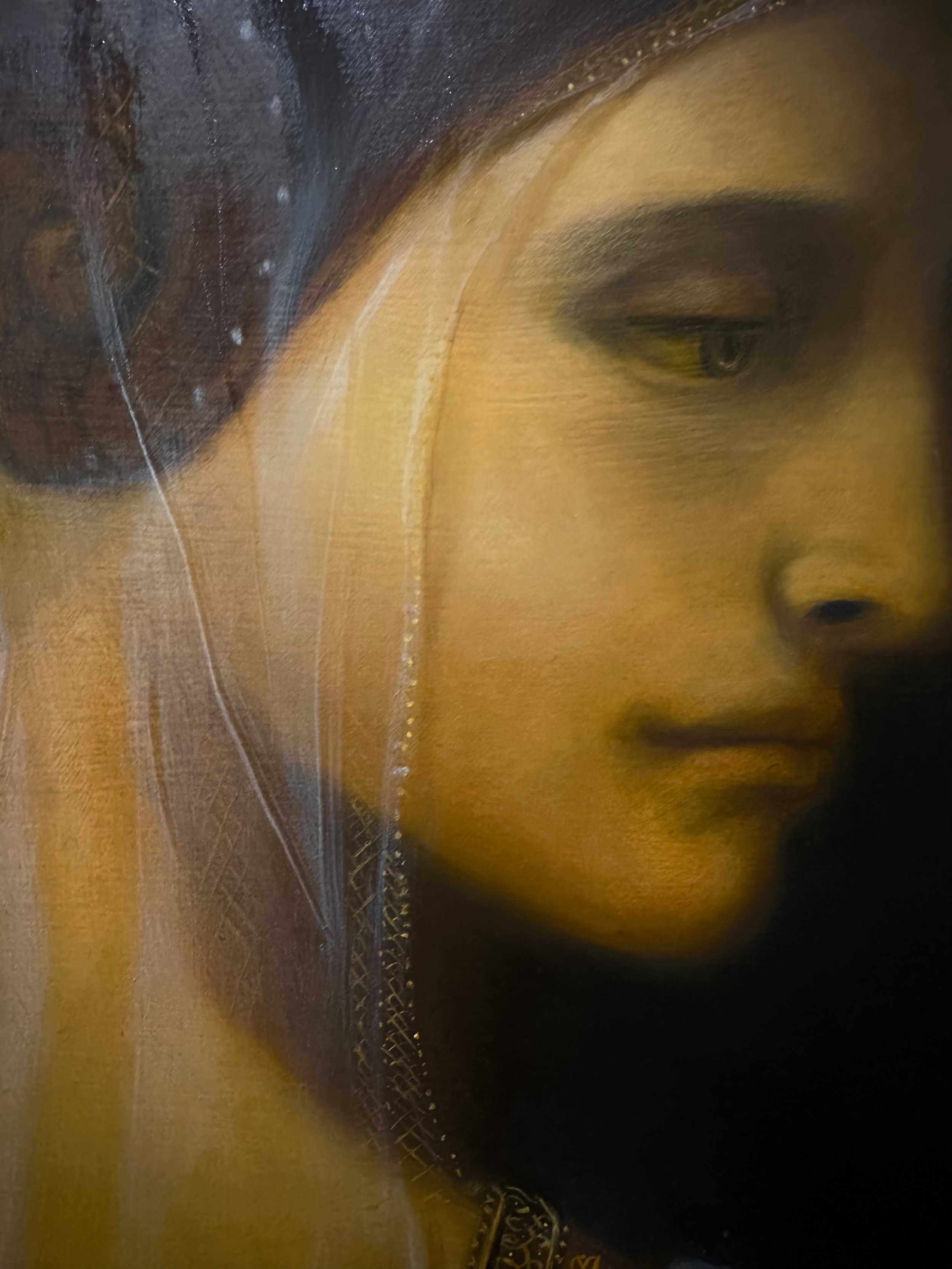
Step 5: Colour glazing
Using ultramarine blue and the glazing technique to colour the cloak of Narcissus. Semi transparent glazes of skin tone are also used to build up the flesh upon the body
Once reasonably satisfied with the modelling of the silver tunic and the sleeve, I move finally into adding some stronger chroma to the painting to start working out the colour relationships. Here, a transparent layer of ultramarine blue has been glazed over the cloak which falls next to Narcissus’ knee.
I note here that this was only my second ever painting and that I was not year aware of the nuanced differences between artificial French ultramarine and the genuine pigments based on lapis lazuli. Therefore, at this stage the blue is far too intense - but as you will see, will be rectified later on! In some reproductions of this painting, the blue cloak looks far more green than blue. In others it is very blue. I believe there are two possible explanations for this. First, the yellowing of the varnish and linseed oil combined with blue often causes a transition towards green with time. Second, Caravaggio was also known to use azurite as a blue pigment when lapis lazuli was not available. Some grades of azurite can be more green than others, depending on the relative quantities of the different ionic states of the copper in the compound. Here I opted for the ultramarine because I think the colour harmony of the blue works well with the cool blue-grey silver of the tunic.
Looking closely at the arms, you can also see in this picture the beginning of the application of the skin tones to the flesh. The skin tones are applied in thin semi-transparent layers of lead tin yellow, yellow ochre, and lead white. The translucency allows the lead white underpainting still to have a structural effect. Besides, human skin itself is translucent and not opaque - and this approach (in my opinion) of draping flesh tones over a structural underpainting gives rise to far more convincing flesh. Works of Titian and Vermeer also show this technique employed extremely effectively - with often a green underpainting showing through the flesh tones. The variation of greenness very well reproduces the natural variations in skin tone where it is closer or farther from blood supply or is close to the underlying skeleton. At this stage, I do not add any warm red colours to the skin colour and the final result is more of a dead-tone colour than a full bodied flesh tone. The idea is that in the next semi transparent layer of skin tone, I can add pinkness where needed, allowing this dead tone to show through where needed.
Here, I also finally begin some more subtle modelling of the hair - using transparent glazes of burnt umber to apply shadows but still leaving the ground showing through for mid-tones.
Step 6: The skin

More applications of semi transparent skin tones to build up the flesh of the body and face
In this step, I really focus on the application of the flesh tones and bringing tonal unity through the whole composition. This involves a second layer of semi transparent skin tones over the previous layer, bolstering the pinkness where needed (cheeks, nose, hands, ears) with touches of vermilion and cooling where needed (underside of forearms etc) with raw umber.
One thing that all old masters were aware of is that the extremities always appear more pink/red than the rest of the flesh. The exaggeration of this effect again adds an element of reality to paintings that photographs sometimes can not. I promise you, next time you go to the museum and look at works by Rubens or Titian, you will not be able to un-see the almost alarmingly red hands, feet and ears!
You can also see at this stage that I have removed the garish layer of French ultramarine and will after this photo is taken apply some genuine lapis lazuli - which has a more subtle, greyish tone and is much better in keeping with the original Caravaggio.
The application here of more thin glazes of burnt umber gives the shadows a really ominous depth - see the big shadow in the left hand sleeve for example. I also noticed that the application of a thin glaze of yellow ochre over the top of the lead-white highlights that were scumbled in for the hair, gives a really beautiful effect of blonde highlights catching the light in the otherwise brown hair.
Step 7: Final touches and varnishing

Varnishing using two coats of a traditional dammar varnish
Conclusions
What did I learn from the study?
A serious appreciation for the importance of values throughout the composition. The fact that the painting already made so much sense before any sort of colours are applied really illustrates how critical this is.
The use of allowing the ground to show through in places makes for a really beautiful mid-tone effect in the painting.
There really is no alternative to lead white for subtle modulation of highlights.
How important it is to vary the level of “detail” in a composition, to guide the eye to the important parts of the picture and give a more realistic sense of how the human eye sees.

References:
Articles:
The following articles were extremely valuable during the preparation of this painting.
https://www.nationalgallery.org.uk/upload/pdf/keith1998b.pdf
https://www.jstor.org/stable/24640790?read-now=1&seq=7#metadata_info_tab_contents
Books:
Caravaggio: Works in Rome: Technique and Style - Rossella Vodret, Silvana; 1st edition, 2016
Caravaggio's painting technique, G. B. Brunetti & M. Ciatti, Nardini, 2012
Any comments or questions?
I’m always more than happy to answer any questions about my work - please do feel free to leave a comment in the section below, or contact me directly here.